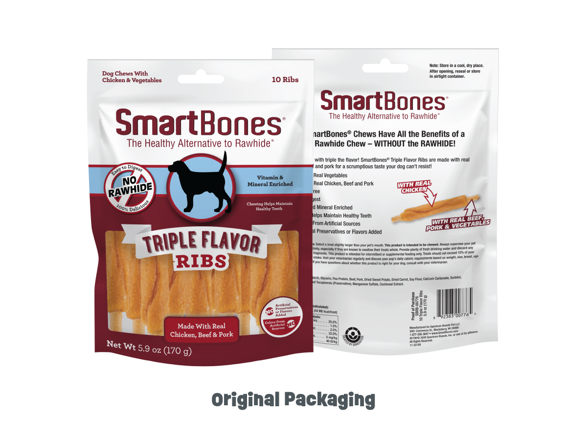
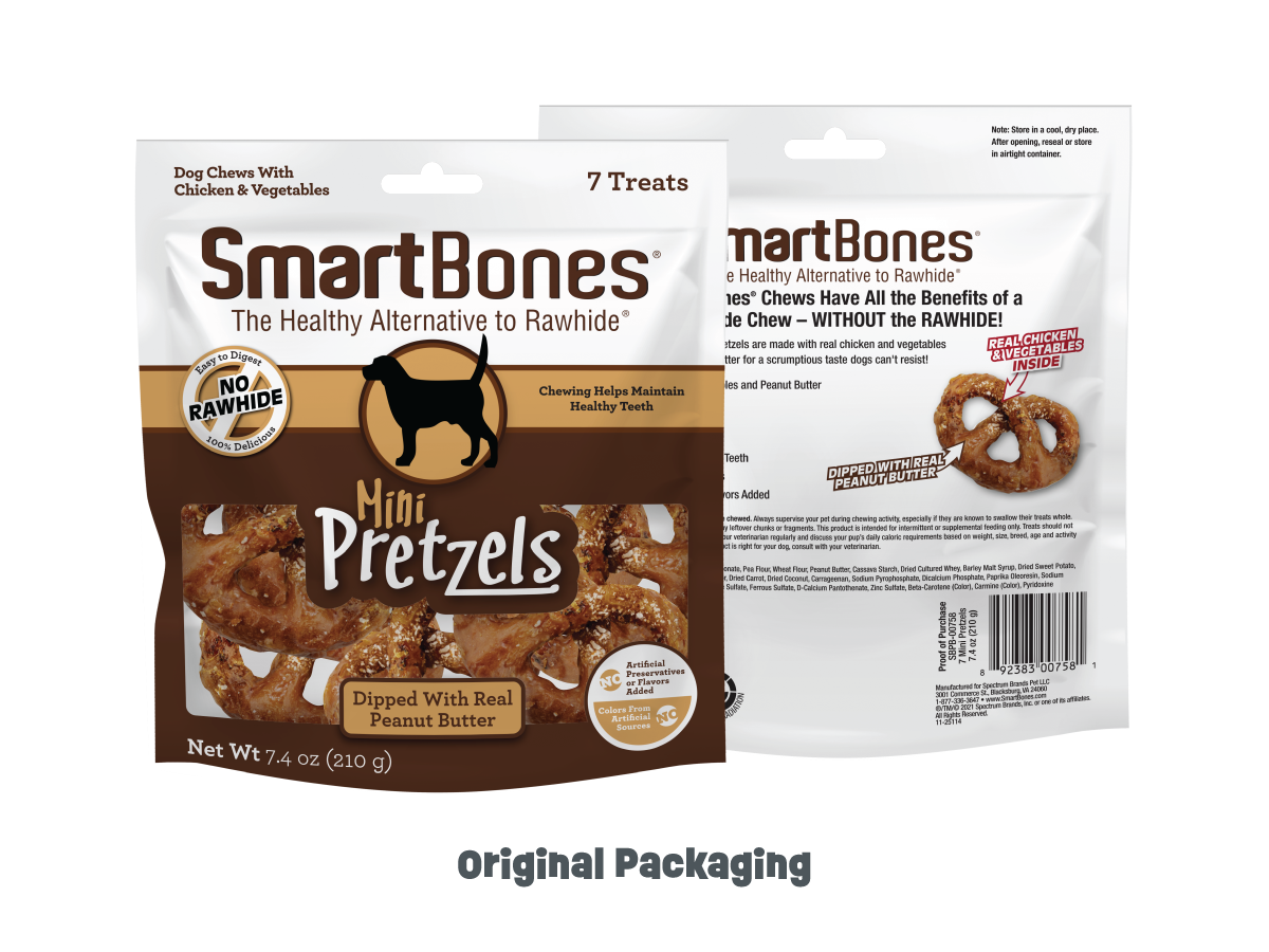
SmartBones® produces rawhide-free chews made with real chicken and wholesome vegetables, positioned as a healthier, highly digestible alternative. While retaining recognition since 2008, the brand needed a modern visual system to remain competitive.
A conceptual refresh introduced a revitalized identity and laid the groundwork for a 2026 packaging overhaul aimed at hierarchy, clarity, and playful differentiation.
Production Artist / Graphic Designer
Brand Refresh & Packaging Strategy
Future Refresh Concepts
Evolve a legacy identity into a modern, competitive packaging system that strengthens shelf presence and benefit clarity while preserving established brand equity.
Translate the brand’s intelligence and better-for-you positioning into cohesive visual storytelling. Typography, mascot, hierarchy, and color were optimized to reinforce benefits, emotional appeal, and differentiation while preparing for regulatory compliance.
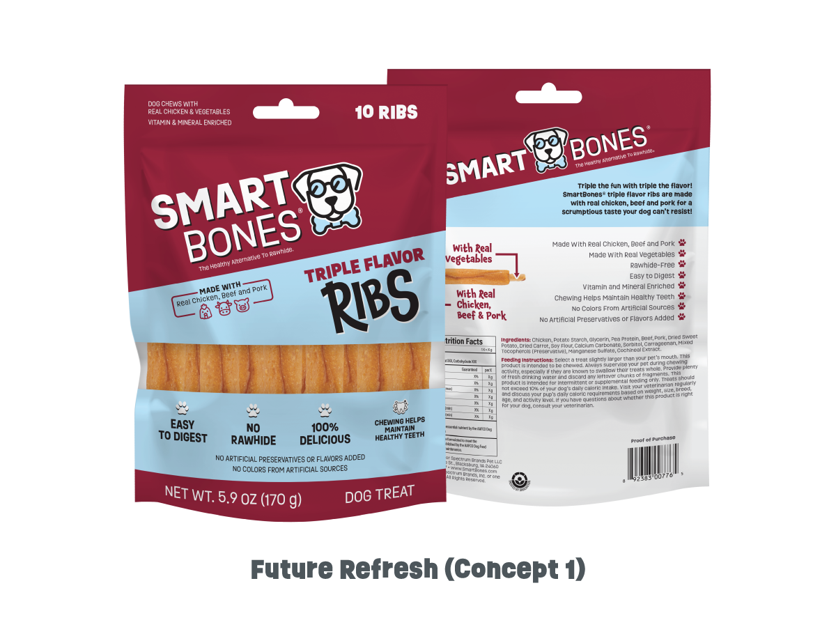
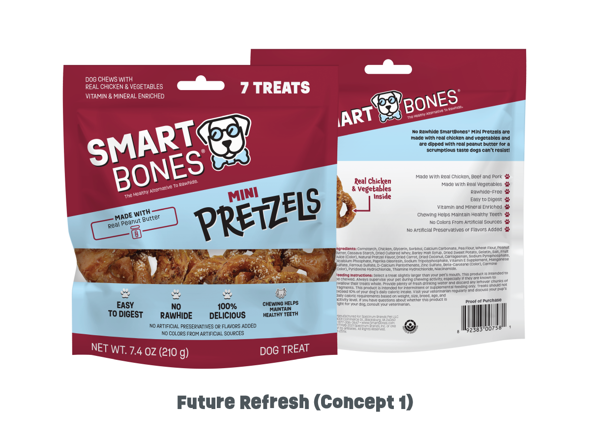
Concept 1 preserved core brand equity while modernizing the identity to strengthen shelf relevance. The wordmark was refined for improved legibility and scalability, maintaining familiarity while introducing a cleaner typographic structure suited for contemporary retail environments.
A newly developed dog mascot—featuring glasses and a “bone-tie”—visually codified the brand’s “smart choice” positioning, transforming a conceptual attribute into an ownable brand asset. A more expressive product font injected energy into the portfolio, supporting differentiation within a category often dominated by similar typographic treatments.
The clear product window was strategically reduced to reclaim real estate for high-priority claims, improving benefit hierarchy without sacrificing product visibility—an important trust driver in the pet aisle. The concept also proactively integrated upcoming 2026 PFLM requirements, ensuring regulatory compliance was embedded seamlessly into the design system rather than retrofitted later.
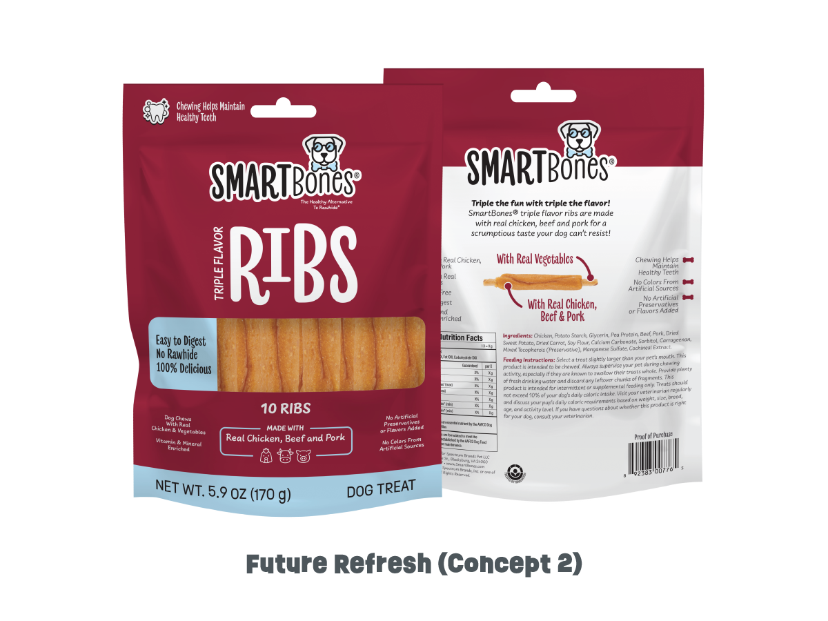
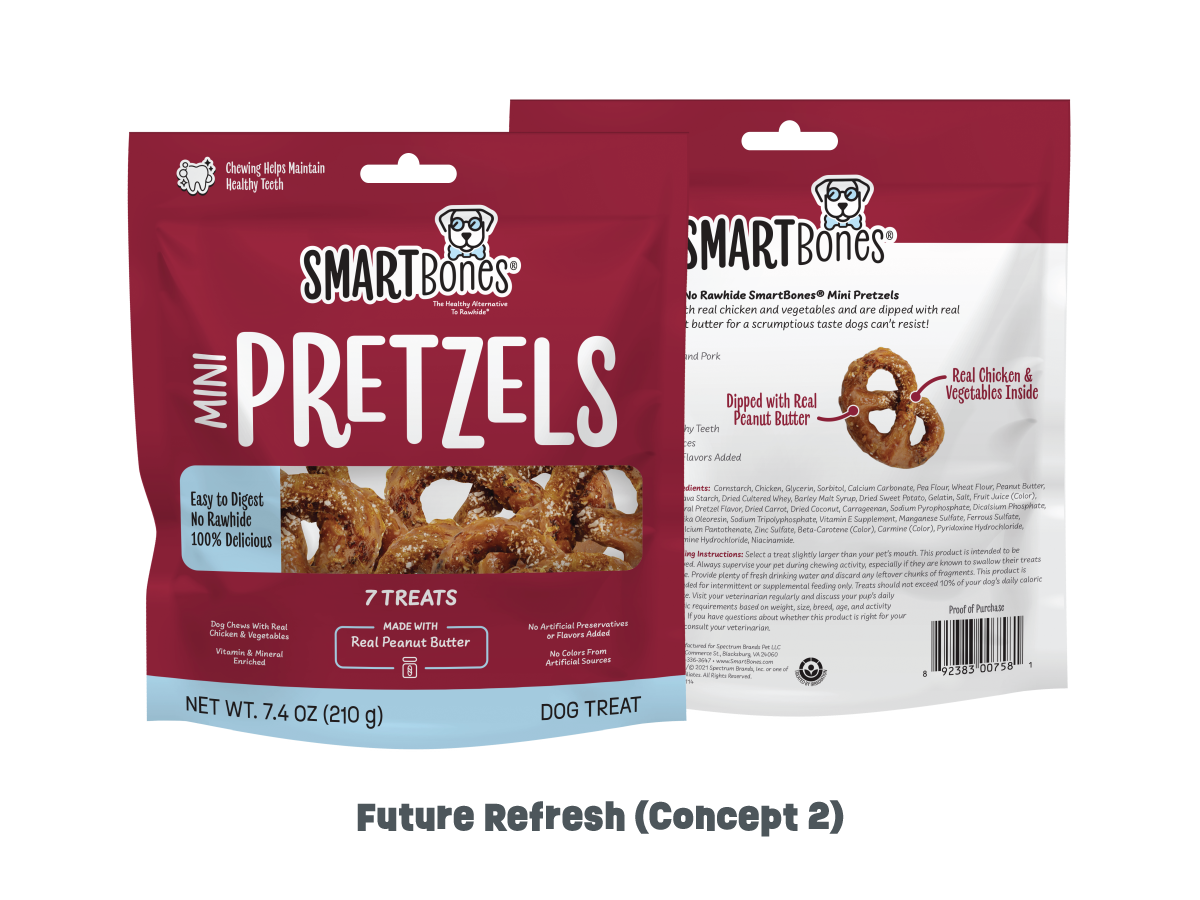
Concept 2 built upon the equity-driven foundation of Concept 1, softening the brand’s tone to broaden emotional accessibility. A rounded wordmark and updated packaging typography introduced a more approachable, friendly aesthetic—intended to resonate with pet parents seeking both intelligence and warmth in their purchase decisions.
This direction explored the balance between authority (“smart”) and approachability, evaluating how subtle typographic shifts can influence brand perception and shopper connection without compromising recognition.
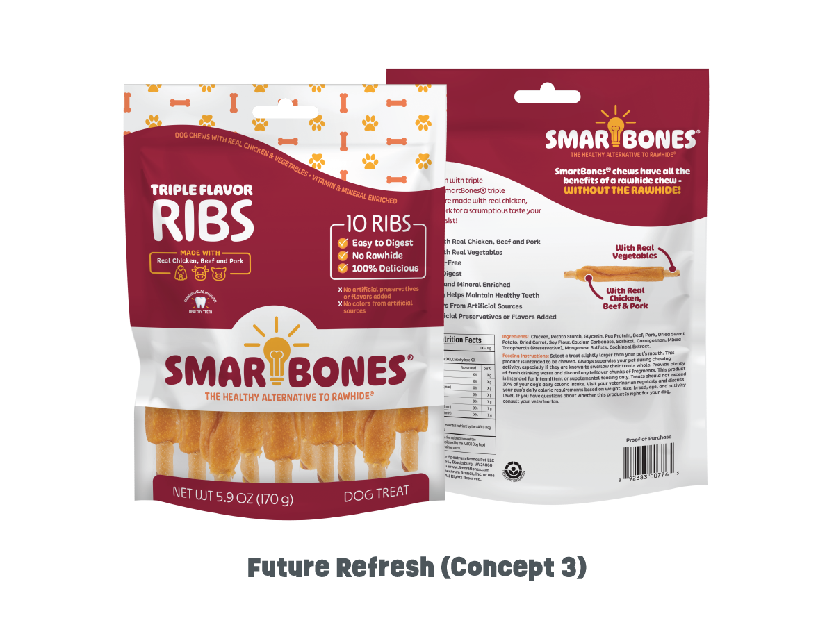
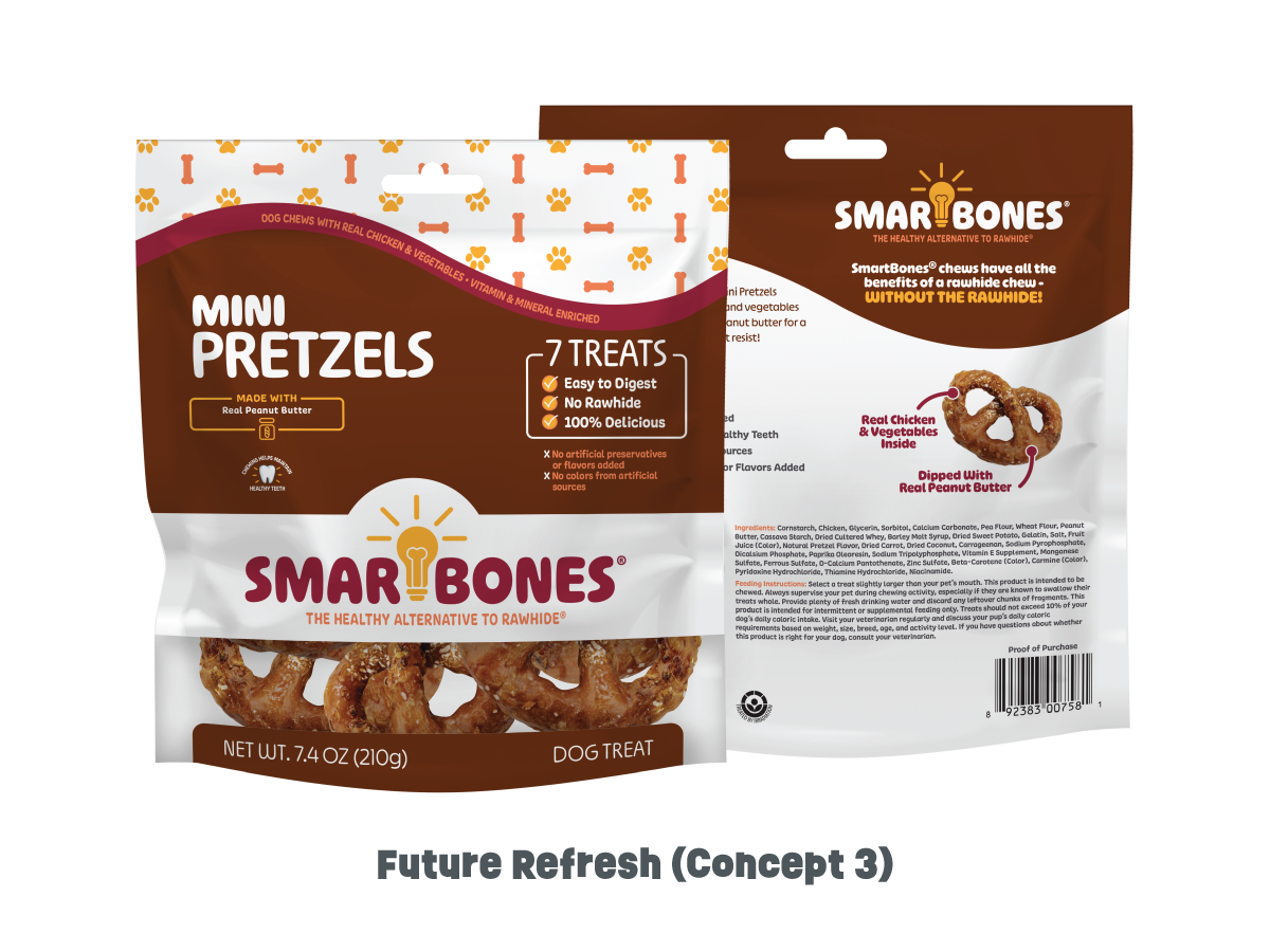
Concept 3 pushed the brand further into distinctive territory through a fully rounded logo system and the integration of a lightbulb-inspired letterform—an explicit visual metaphor reinforcing the brand’s “smart” positioning. This move aimed to create a more ownable and memorable identity device capable of extending across packaging, digital, and promotional touchpoints.
A bolder, expanded color palette and increased pattern usage enhanced shelf blocking and visual disruption within a competitive set. Like the other directions, this concept was designed with 2026 PFLM requirements integrated from the outset, demonstrating how regulatory considerations can coexist with strong visual storytelling.
Original SmartBones® packaging designs are the intellectual property of Spectrum Brands, Inc. Future Refresh concepts remain the intellectual property of Rachael Hollis unless and until such concepts are formally presented to and produced by Spectrum Brands, Inc. All work is displayed for portfolio purposes only.