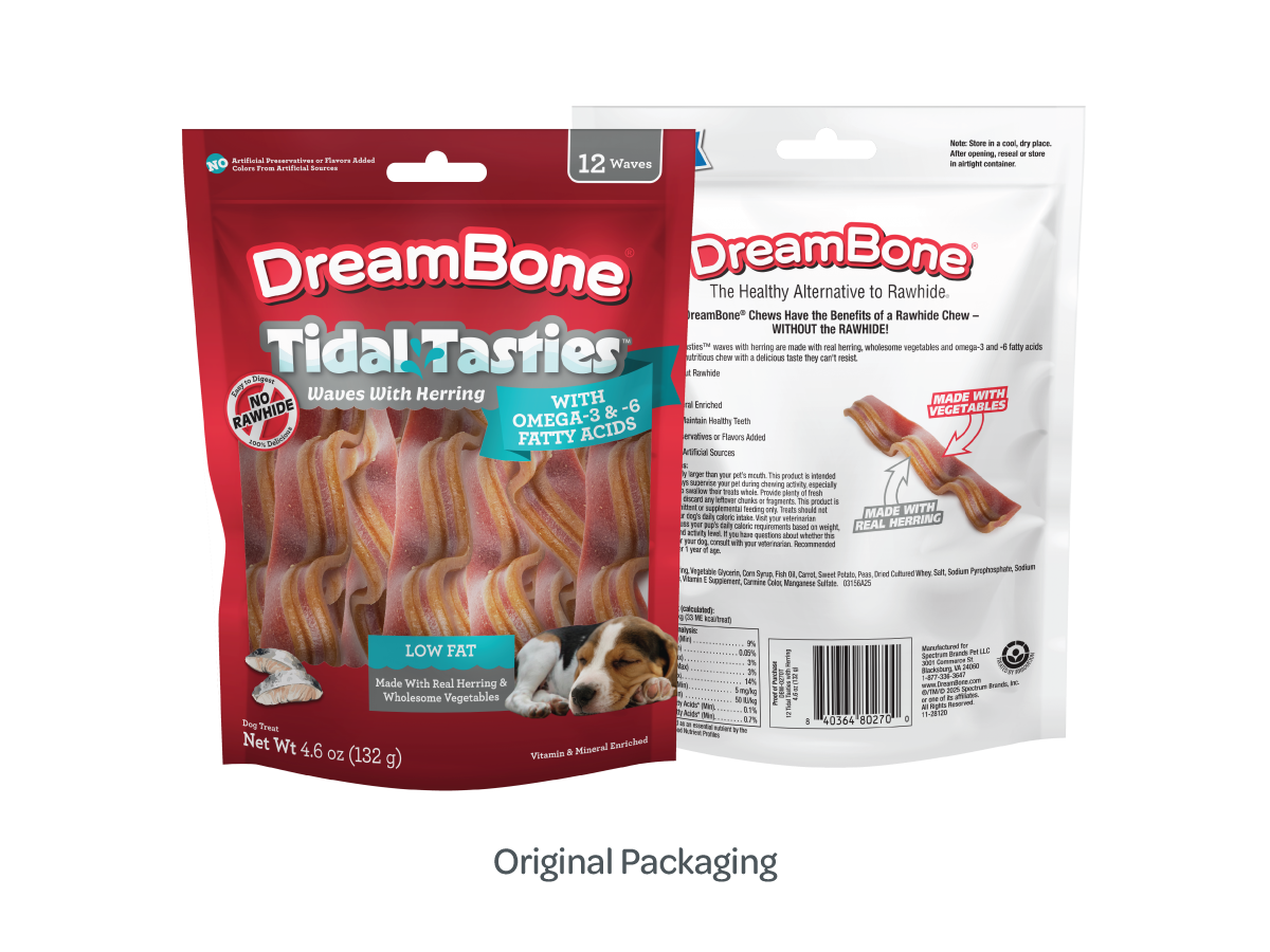
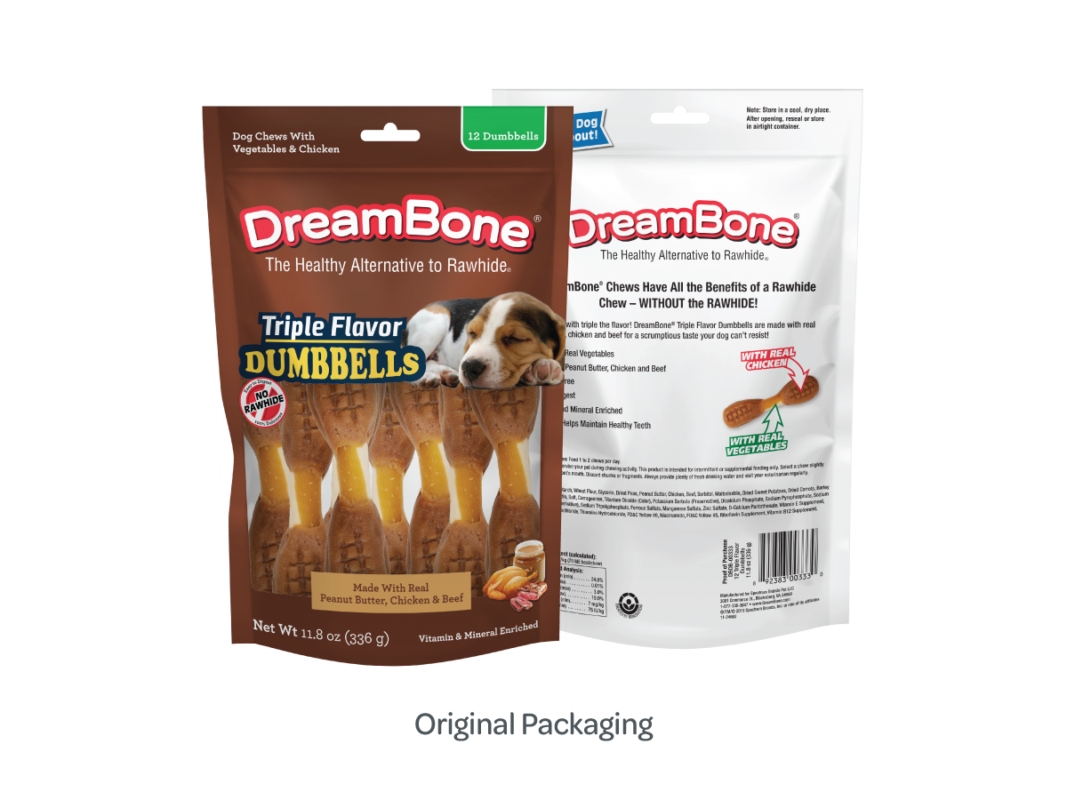
DreamBone® produces rawhide-free dog chews made with real chicken and wholesome vegetables, positioned as a safer, highly digestible alternative to traditional rawhide treats. Since its founding in 2008, the brand maintained core recognition, but the packaging had begun to lose shelf impact against more modern competitors.
A 2025 refresh modernized the visual identity while preserving equity, establishing the foundation for a comprehensive future packaging evolution aimed at improving hierarchy, claims communication, and shelf differentiation.
Production Artist / Graphic Designer
Brand Refresh & Packaging Strategy
2025 Refresh + Future Refresh Concepts
Modernize the brand’s identity to improve shelf visibility, clarify product benefits, and support long-term portfolio growth—without disrupting existing consumer recognition.
Transform functional and emotional brand attributes into visual assets. Typography, color, imagery, and packaging structure were refined to enhance hierarchy, reinforce emotional appeal, and ensure regulatory readiness.
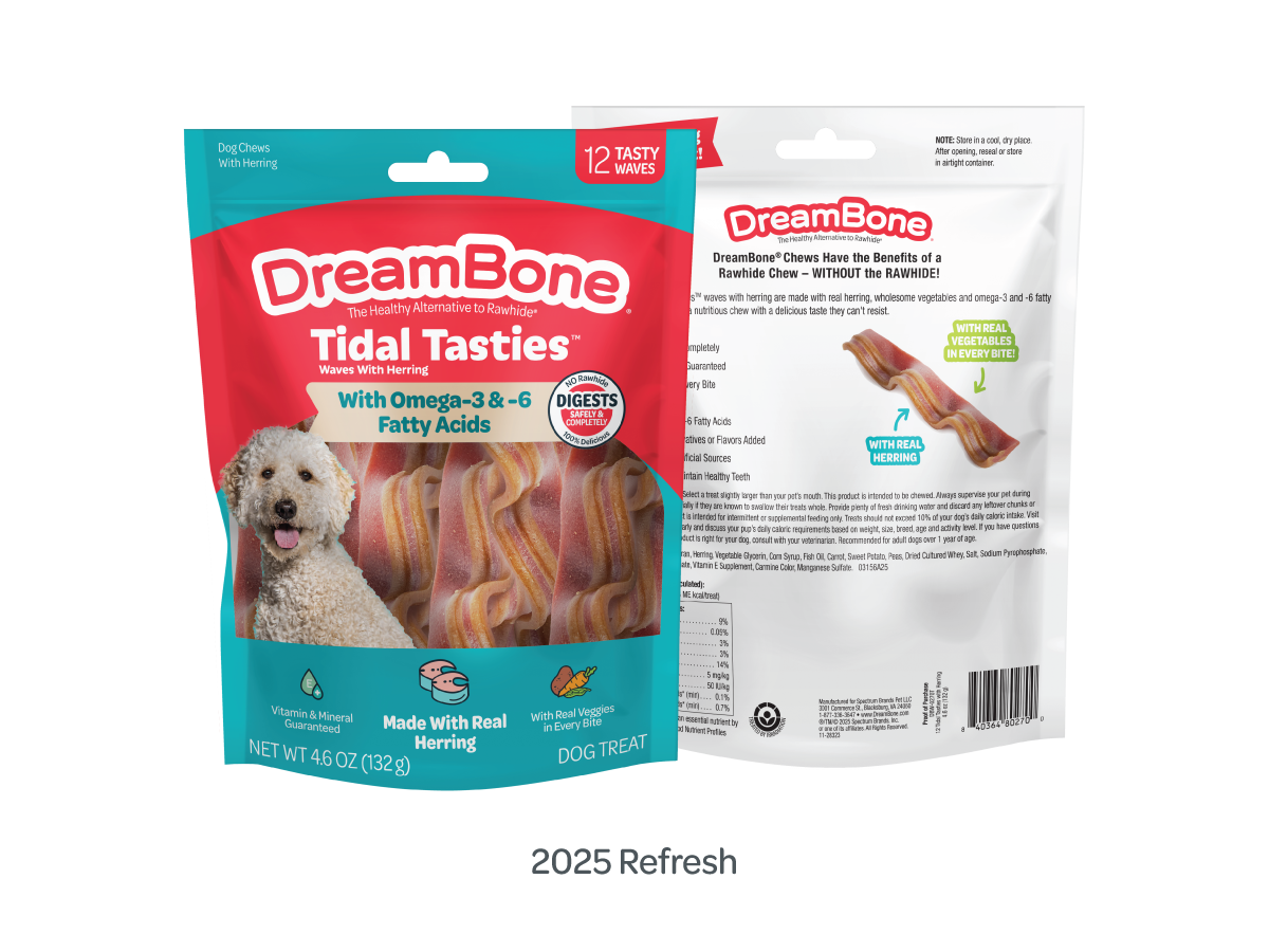
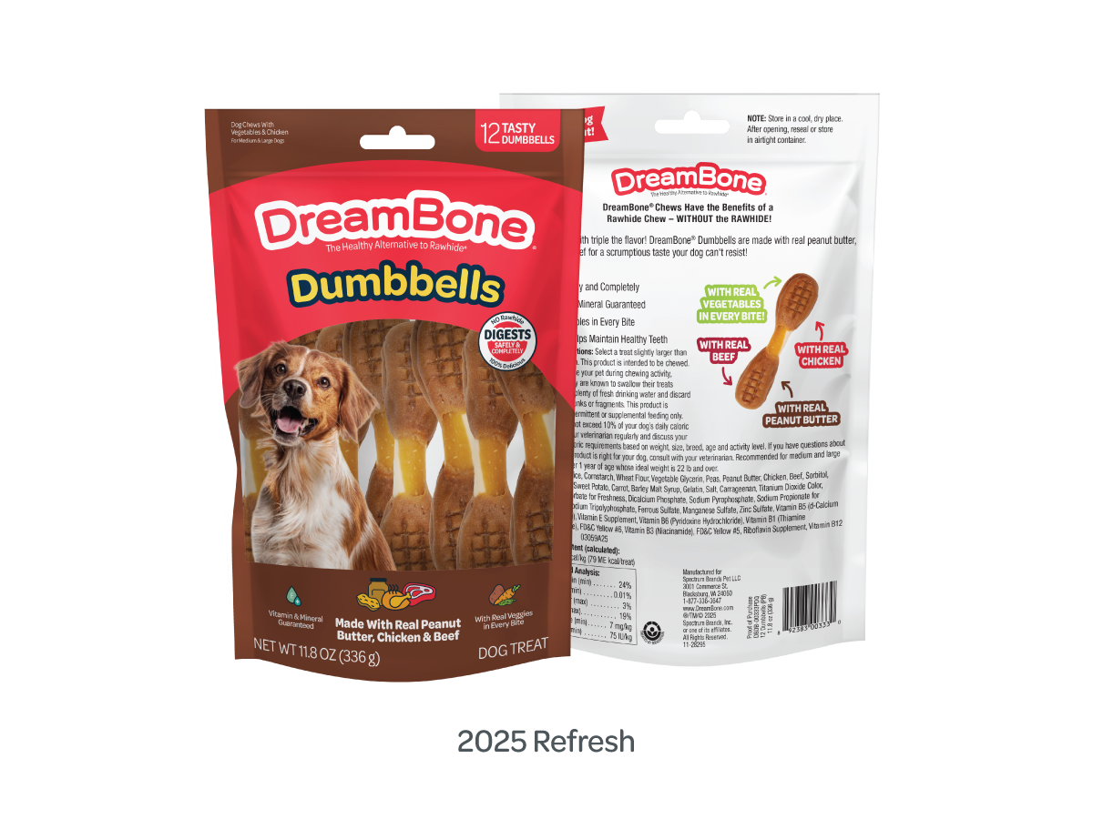
The 2025 refresh focused on modernizing the brand while preserving core equity to maintain consumer recognition and retailer continuity. The logo was simplified and paired with a refined color palette to improve clarity, scalability, and cross-platform consistency.
Clear packaging windows were intentionally retained to reinforce product transparency—an established trust driver in the pet category—while updated benefit claims and more dynamic imagery strengthened hierarchy and improved shelf communication. The result was a system that balanced familiarity with visual impact, increasing stand-out in a crowded, muted competitive set while protecting brand recognition.
Consumer testing ultimately favored the original packaging, noting that the updated design diminished some of the distinctiveness in the product names. As a result, the direction was refined to reintegrate new claims within the established design framework.
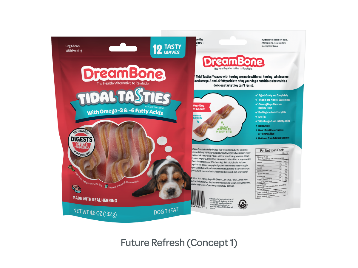
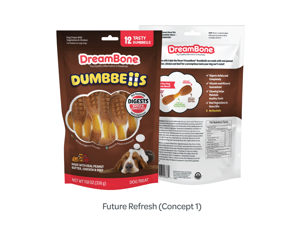
Concept 1 reimagined the structural window as a “dream bubble,” transforming a functional element into an ownable brand device. This reinforced the core emotional proposition—treats dogs dream about—while maintaining strong product visibility, a key driver consistently preferred in consumer testing. The dog imagery was also reverted to a sleeping pose and positioned adjacent to the bubble window, visually linking the product to the idea of dreaming and strengthening the narrative on pack.
By preserving the brand’s established color system, the refresh maintained critical shelf blocking and recognition equity—ensuring the evolution felt intentional and progressive rather than disruptive to loyal consumers.
Typography was carefully evolved to bridge the 1.0 refresh with the brand’s original playful spirit, ensuring progression without alienation. The concept was also designed to proactively integrate 2026 PFLM requirements, demonstrating forward-thinking compliance planning without compromising visual integrity.
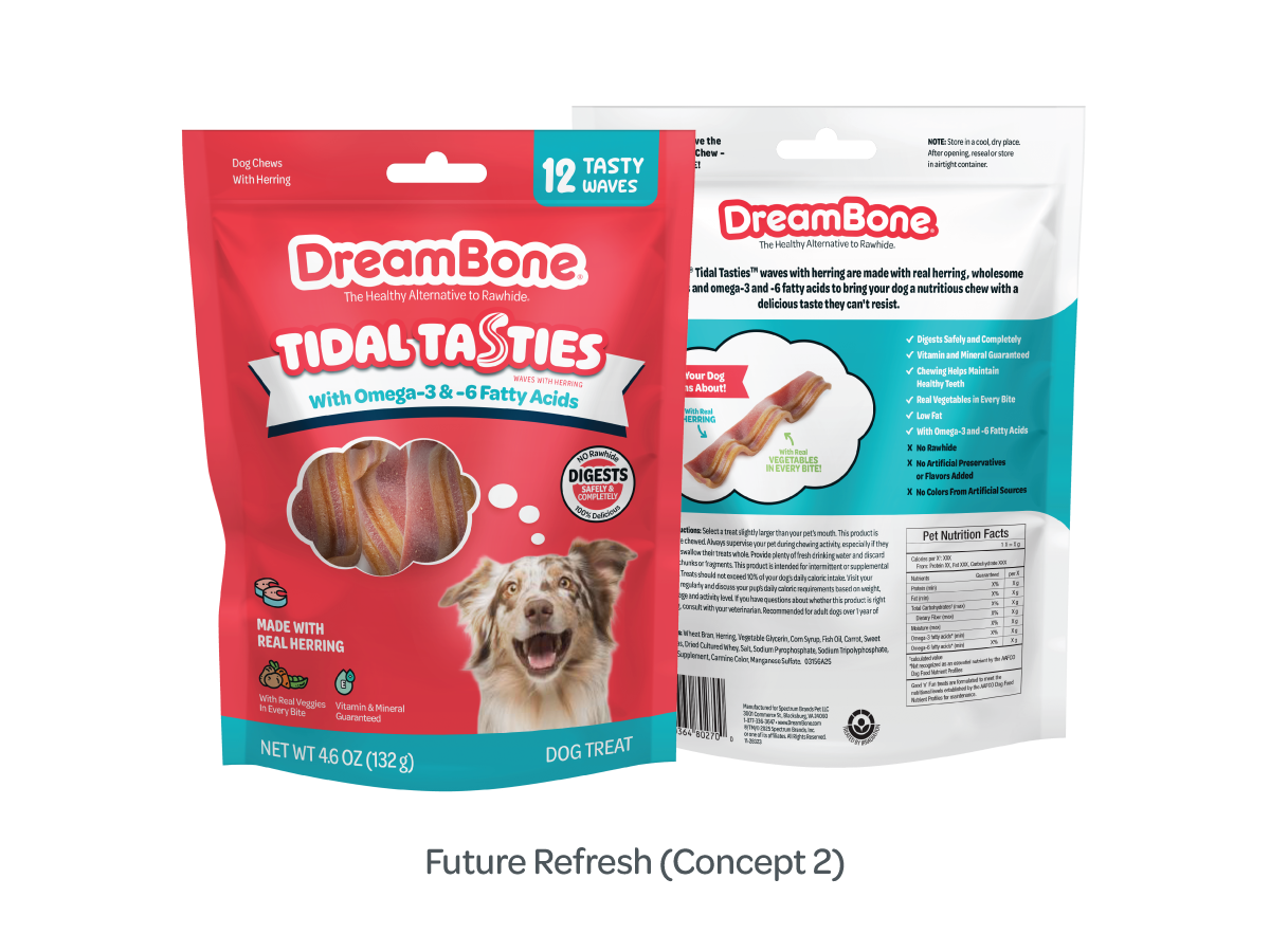
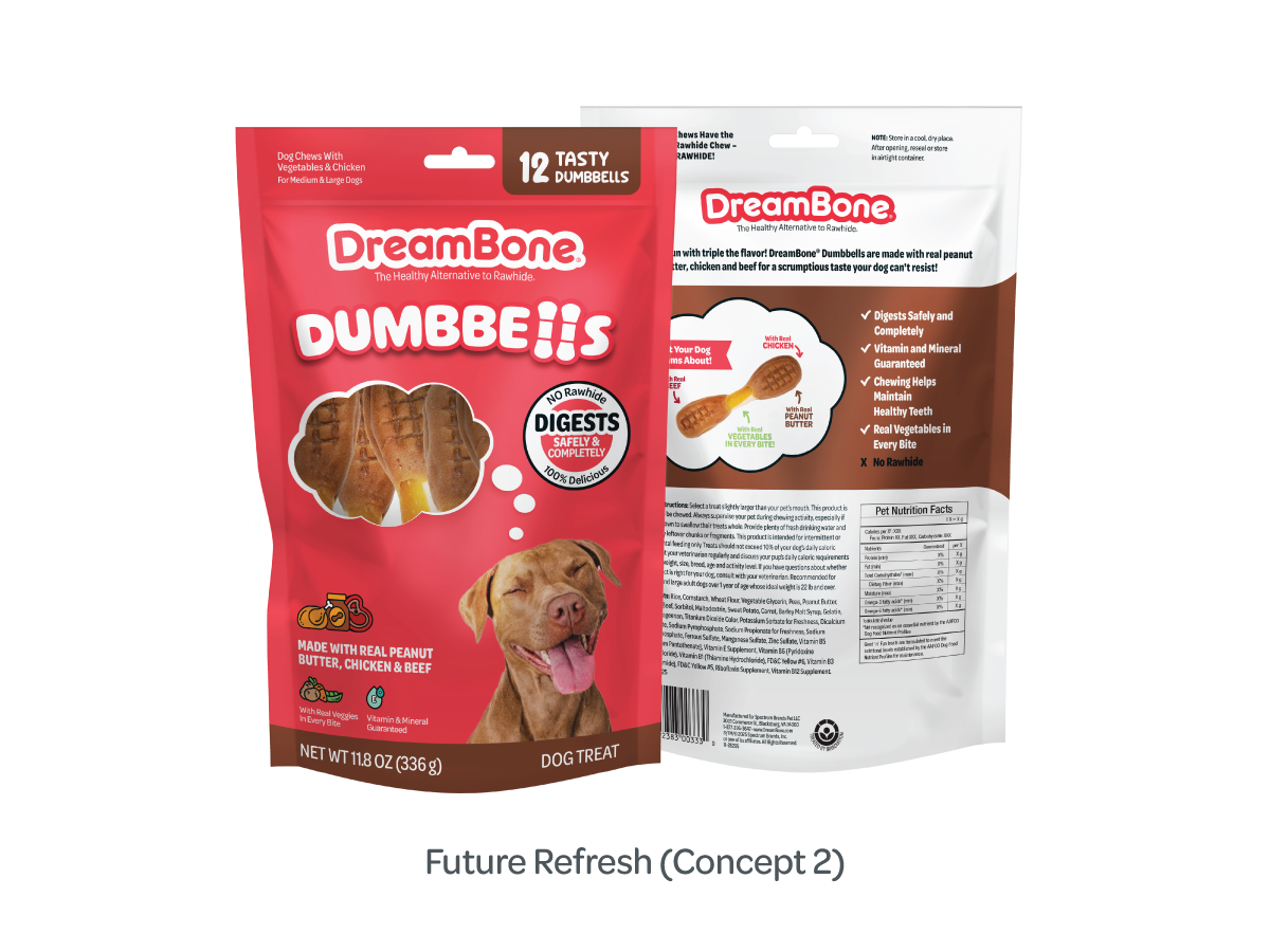
Concept 2 built on the evolution introduced in Concept 1, reducing the “dream bubbles” window to reclaim space for priority claims while maintaining the core visual idea.
A more assertive color strategy expanded DreamBone® red to flood the pack, amplifying shelf blocking and increasing visibility against competitors dominated by neutral palettes. Updated photography of a smiling, daydreaming dog supported emotional engagement and reinforced the aspirational brand narrative.
Typography preserved the brand’s playful spirit, allowing for thoughtful progression without alienating existing consumers, while a streamlined color palette created a more cohesive and modern visual system.
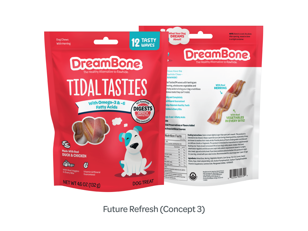
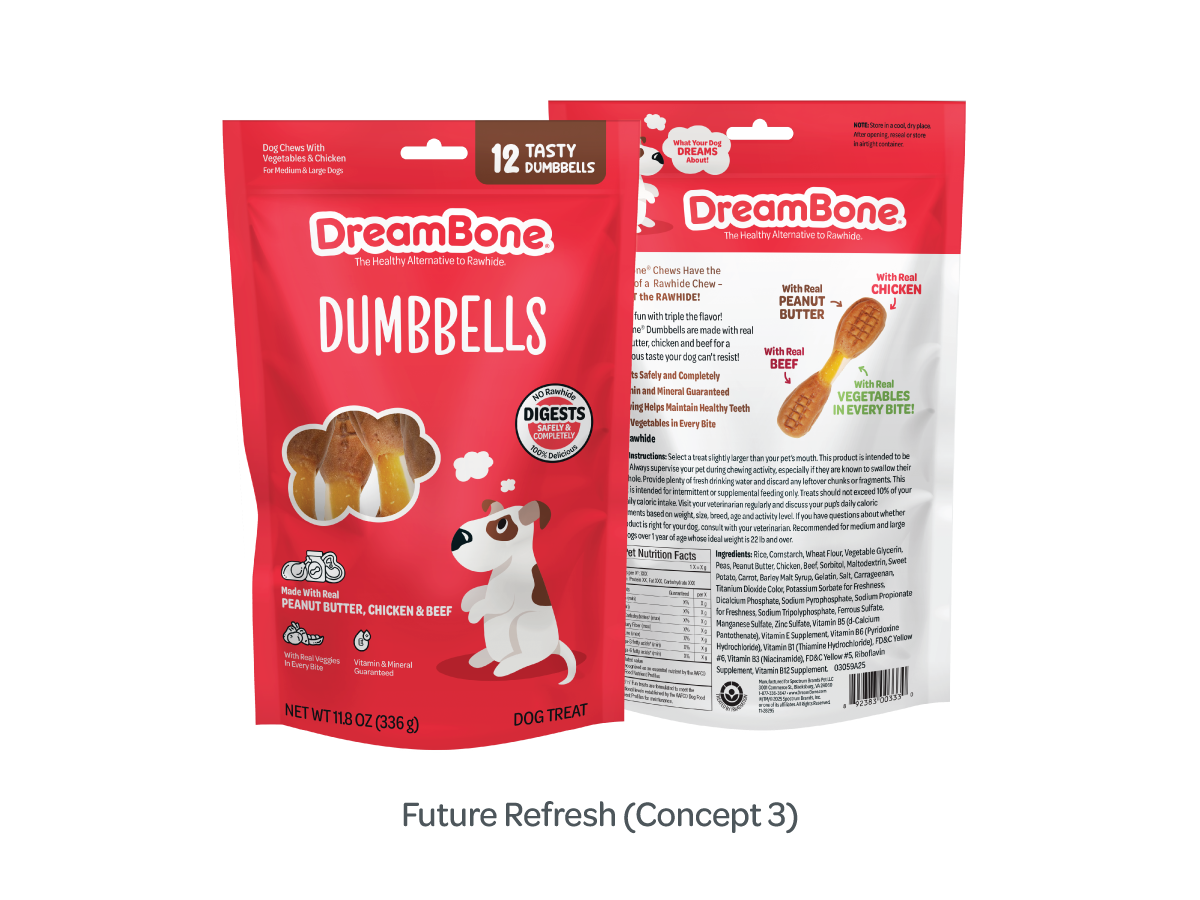
Concept 3 refined the strategic direction of Concept 2 through typographic and visual simplification. A taller, thinner product name improved vertical flow and shelf readability, while a flatter typographic treatment created a more contemporary and scalable identity system.
The exploration of illustration over photography introduced a more distinctive, cartoon-inspired aesthetic—potentially increasing memorability and brand ownability in a category heavily reliant on similar pet photography. This approach evaluated the trade-off between emotional realism and brand differentiation, positioning the design as both expressive and strategically disruptive.
Original DreamBone® and 2025 Refresh packaging designs are the intellectual property of Spectrum Brands, Inc. Future Refresh concepts remain the intellectual property of Rachael Hollis unless and until such concepts are formally presented to and produced by Spectrum Brands, Inc. All work is displayed for portfolio purposes only.