Laulie Cakes is a Missouri-based bakery specializing in custom cakes, cupcakes, and cookies for everyday treats and special events. While beloved locally, the visual identity no longer reflected the warmth, creativity, and quality of the bakery’s offerings.
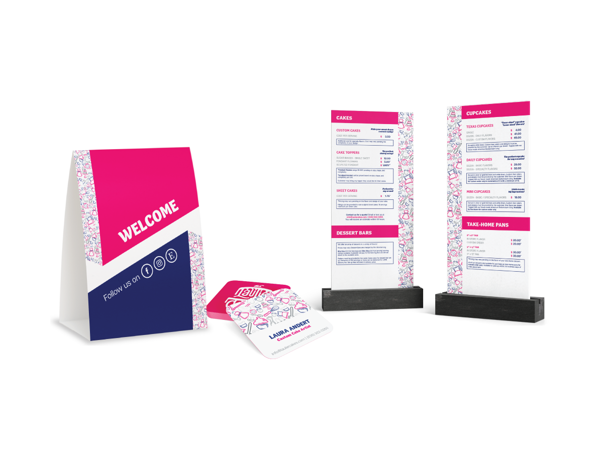
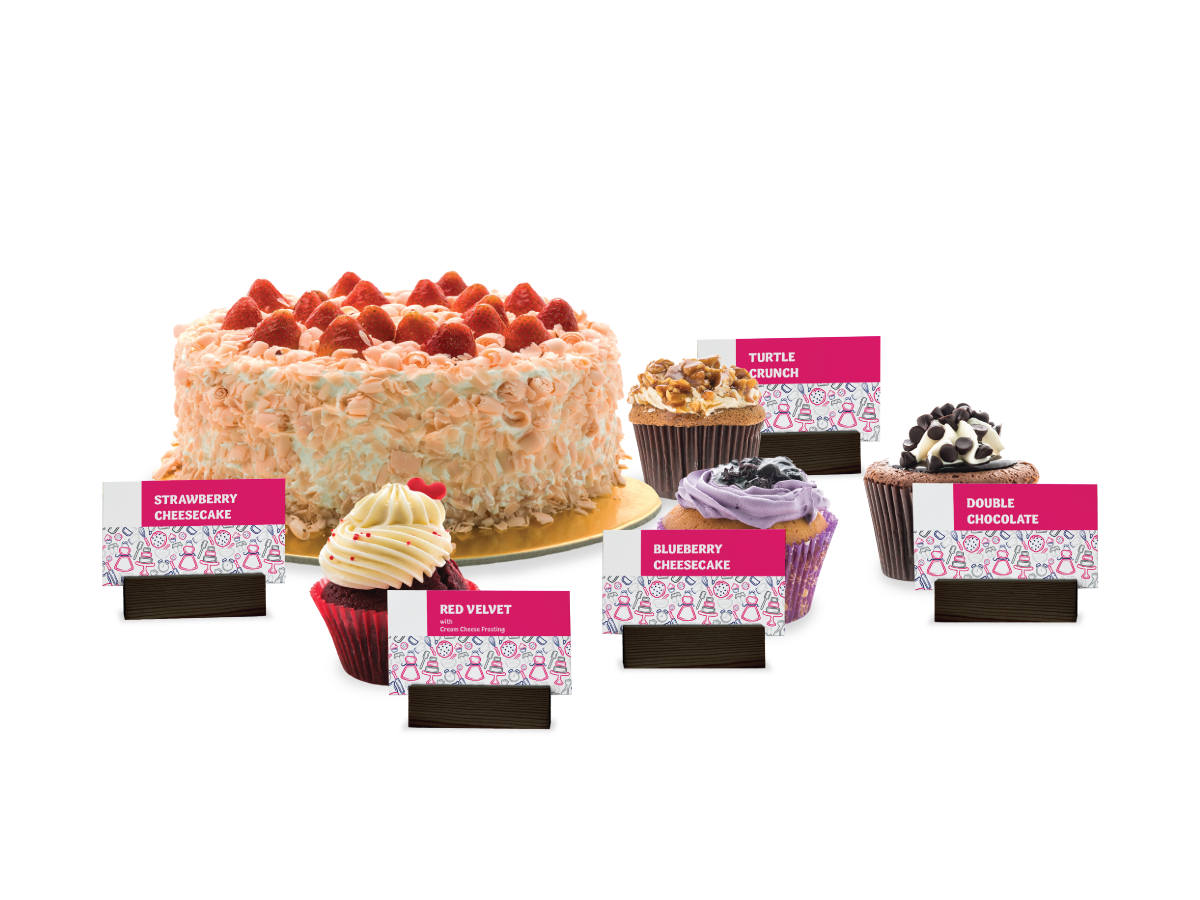
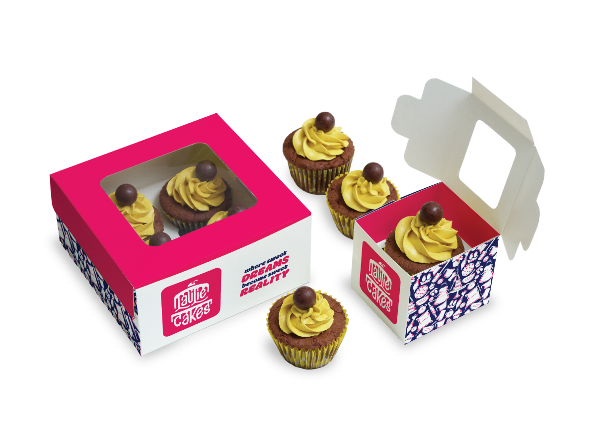
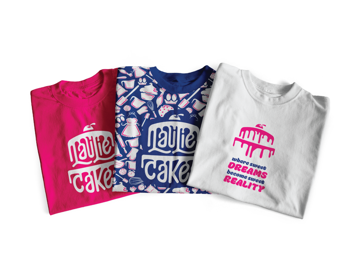
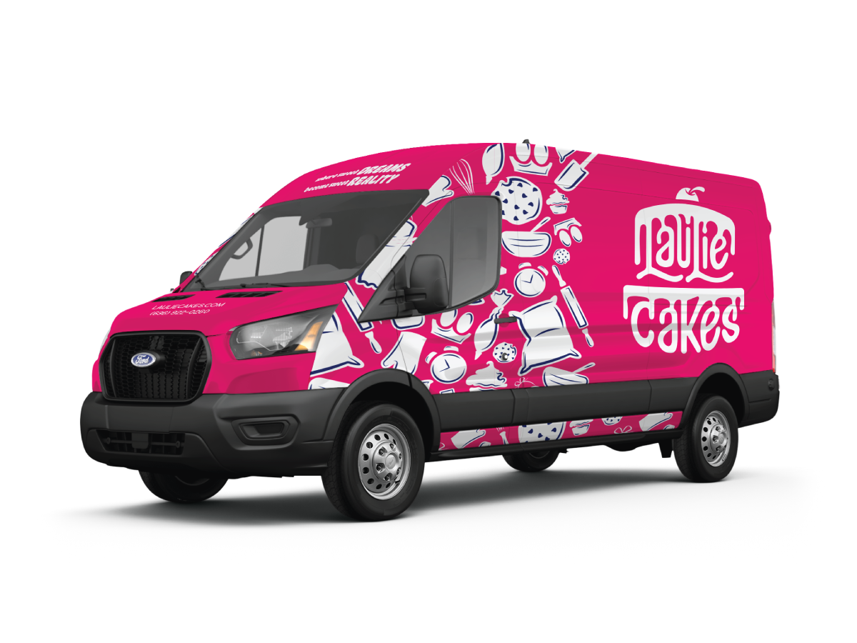
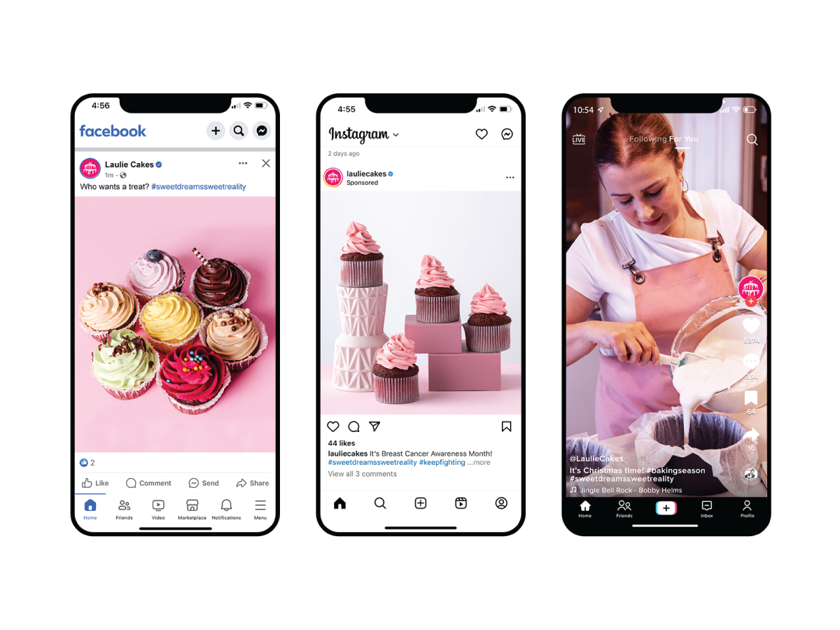
A strategic refresh was developed to align the visual system with the bakery’s handcrafted approach, creating a cohesive identity that could be applied across packaging, marketing, and digital touchpoints.
Brand Designer
Brand Strategy: Print & Digital Media
Updated Brand Identity

Elevate the brand identity to reflect premium craftsmanship and personal service while maintaining warmth and community familiarity.
Balance elevated craftsmanship with heartfelt personality. Typography, color, and supporting graphic elements were refined to communicate quality and care, while maintaining softness and approachability. The system was designed to feel handcrafted yet polished, mirroring the bakery’s products.
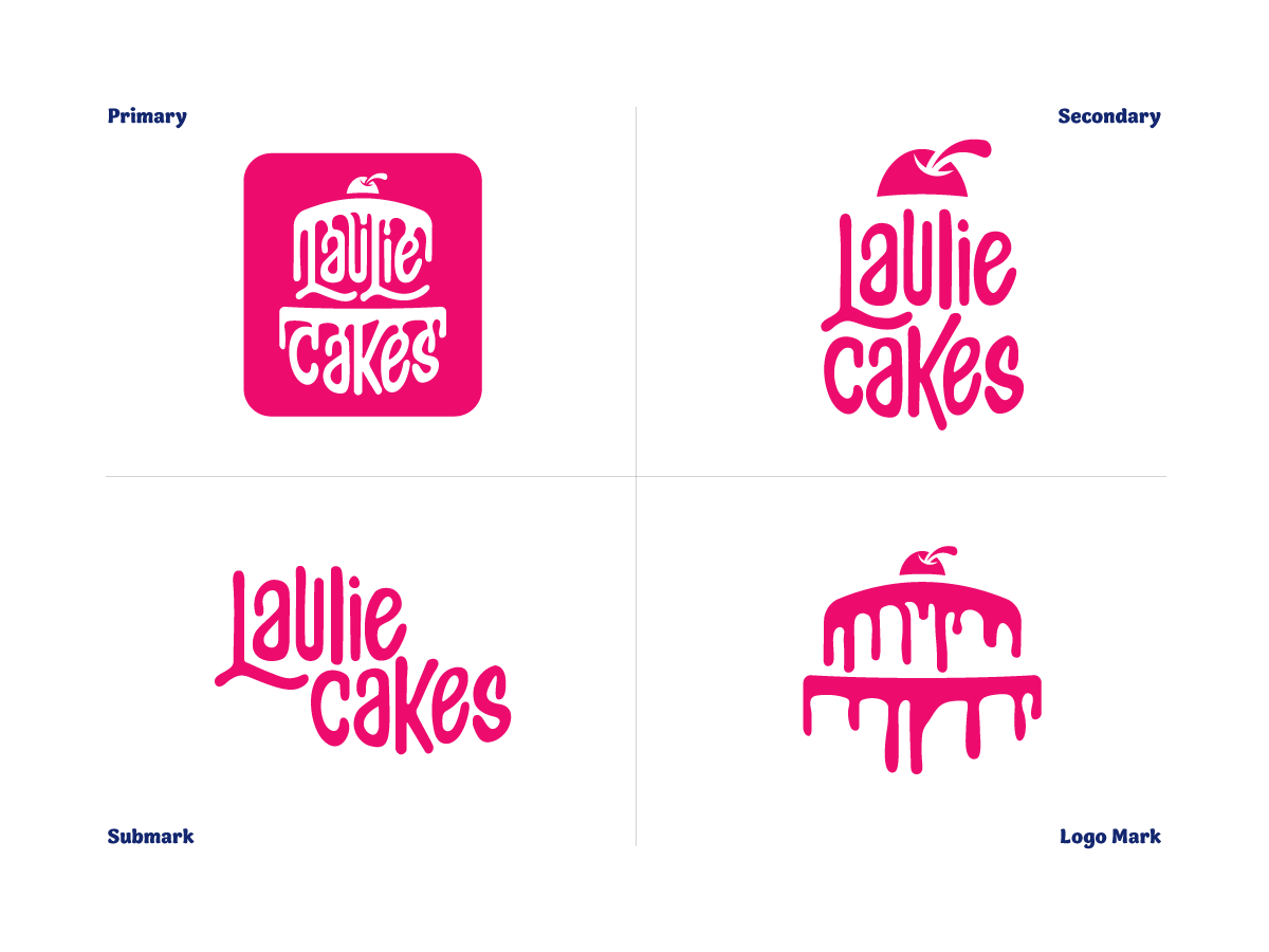
Reimaging the logo through custom hand-drawn lettering to reinforced the bakery’s artisanal personality, creating a timeless, scalable mark capable of performing seamlessly across physical and digital touchpoints.Redrew the logo by hand to preserve a unique artisanal feel while refining balance and scalability.
Concepts shown above are the intellectual property of Rachael Hollis. All work is displayed for portfolio purposes only.